
The Apple Watch has landed. It's Apple's first new product category since the iPad(2010) and the company's first new user interface since the iPhone(2007). But unlike previous product launches, Apple is struggling to come up with a coherent marketing message for their wearable. A legitimate question that I often hear is "Why would I need an Apple Watch if I already have a smartphone?"That ordinary people are asking this question half a year after Apple announced the product is evidence that the company has done a poor job telling its story. What I realized when my watch finally arrived was that I had three specific questions:
1) Is it a good watch?
2) Do I want to walk around with a small computer strapped to my wrist?
3) Is Apple's implementation of wearable computing compelling?
I've been living with the Apple watch for two weeks now and here are my answers.
Question 1: Is it a good watch?
The way I see it, a good watch needs to do three things:
A. Tell the time
B. Be comfortable
C. Be fashionable
In terms of telling the time, the Apple Watch is a bit of a mixed bag. As a result of battery constraints, Apple chose to keep the watch screen off by default until it is activated. This puts the Apple Watch at a disadvantage when compared to all traditional watches and even some smartwatches, because the time is not always visible. To address this concern, the Apple Watch's gorgeous display turns on when you raise your wrist to your face, but this gesture doesn't work consistently and often requires an exaggerated arm movement. Moreover, the screen never stays on for more than a 15 second interval unless you are directly manipulating it. This is a big knock on the Apple Watch as a watch. I understand that given the current battery technology, it was a necessary compromise, but in the world of traditional watches, battery life is simply a non-issue and part of the Aristotelean definition of a watch is that it persistently tells the time.
As far as comfort goes, I think the Apple Watch is great. During the long waiting period(I placed what must have been one of the very first preorders back in April), I set up a couple of appointments at the Apple Store to try on the various models and band options. Personally, I find the Apple Watch Sport to be the most comfortable. The Sport's body is made of aluminum which makes it lighter than the stainless steel or gold models and the fluoroelastomer band is really nice and supple. I've worn watches for most of my life and I'd go as far as to say that this is the most comfortable watch I've ever had on my wrist.
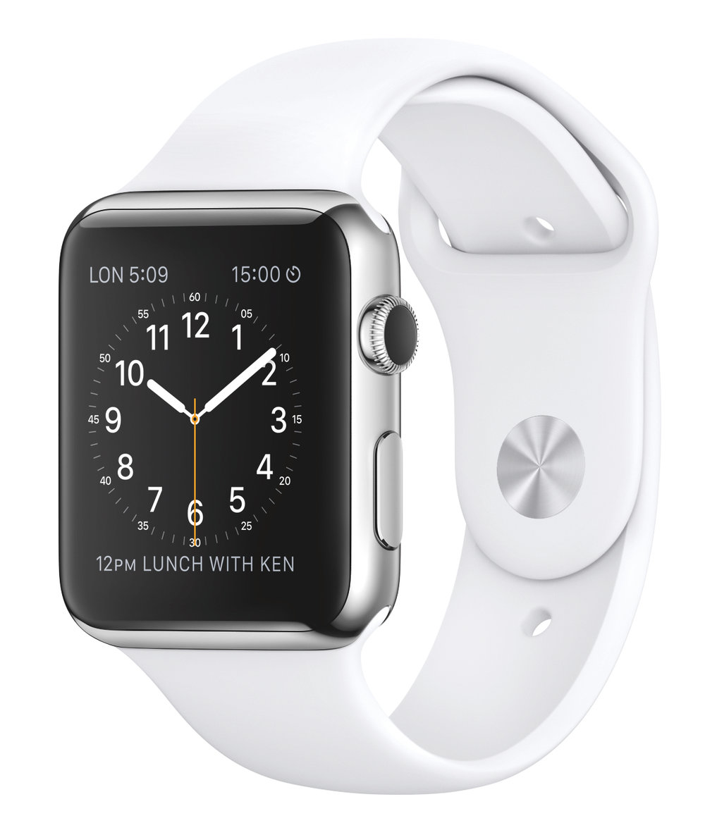
Unfortunately, I don't find the Apple Watch to be particularly fashionable. I've always preferred circular faced watches and Apple's is both squarer and bulkier than my tastes allow. While beautifully made, it is shaped like a throw pillow and sits a little high on the wrist. And though it is smaller than it appears in Apple's PR images, it's still a little computer strapped to your wrist and the more expensive models and nicer bands don't change this. Simply put, it's thicker than a watch should be. On the other hand, the actual watch faces are very stylish and far more customizable than legacy time pieces. Apple pushes its digital advantage here by giving you control over elements of the watch face like the color of the second hand, or how detailed the numbers are. On some of the faces, it even lets you customize "complications"-little bits of useful information that you can select to always be available on your chosen face.
Question 2: Do I want to walk around with a small computer strapped to my wrist?
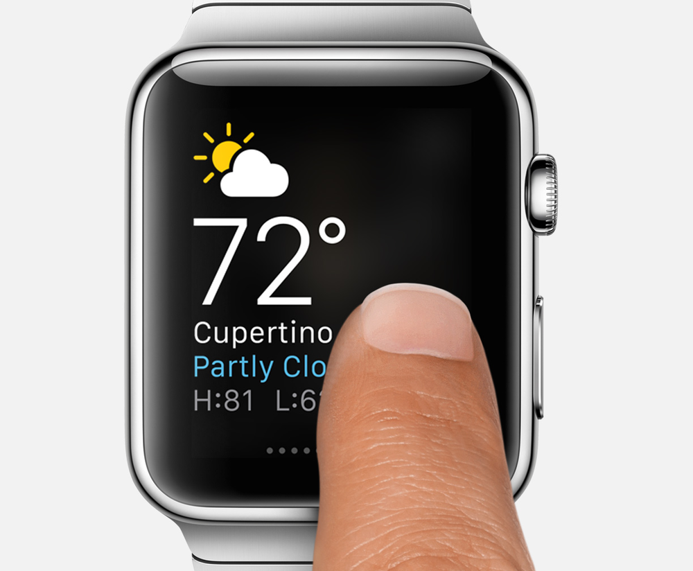
After two weeks of use, I finally see the benefits of wearable computing. The most obvious come in the form of little conveniences. There is a class of interactions that simply makes more sense from the wrist. Having quick access to weather information and sunrise/sunset times(my chosen complications), being able to quickly reply to a text message, fitness tracking, walking directions, paying for groceries, controlling the TV, knowing the minute a delivery arrives, and calling an Uber are all clear arguments for the convenience of wearing a computer on your wrist. It's true that most if not all of these activities can be done with a smartphone, but add up enough of these time-saving advantages and you reach a critical mass. For me, the Apple Watch, even in its current 1.0 state, crosses that threshold with aplomb. It makes these tasks quicker and more convenient than they are on the phone and therefore earns its keep on my wrist.
Question 3: Is Apple's implementation of wearable computing compelling?
Having accepted that wearing a computer on my wrist makes sense, a separate question is whether Apple's vision for wrist computing is compelling. To answer my final question, I'm going to focus on the Apple Watch interface.
Hardware
The first hardware novelty here is the digital crown. As a result of the small dimensions of the screen, the design gods at Apple recognized that the navigational gestures that work so well on the phone would not work on the watch, because your fingers would either obscure or miss the virtual objects you were trying to manipulate. To solve this problem, they came up with the digital crown, which borrows from the design language of traditional watches. Depending on where you are in the watch's interface, moving the digital crown will either scroll up and down or zoom in and out. It has a nice feel to it and it's clear that a lot of thought went into the precise manner in which it interacts with the watch's interface. The crown also doubles as the main hardware button on the watch, giving you quick access to the multiple levels of the interface(the second button which looks like the sleep/wake button on an iPhone is dedicated to getting you to your favorite contacts and Apple Pay). The digital crown is a welcome innovation. It works flawlessly and feels necessary on a device of such diminutive dimensions.
The second hardware novelty is a feature that goes by the unfortunate name of "Force Touch". The Apple Watch's screen is the first in the company's product lineup that can tell how hard you are pressing on it. This pressure sensitivity is used to provide a whole new plane in the watch's user interface. By literally adding a dimension to the touch screen, Apple has elegantly bought itself extra space on the watch. Depending on where you are in the interface, a force touch will often reveal hidden options. For the most part, it works like a charm, but every now and again, I find myself inadvertently knocking the watch and activating it by mistake.
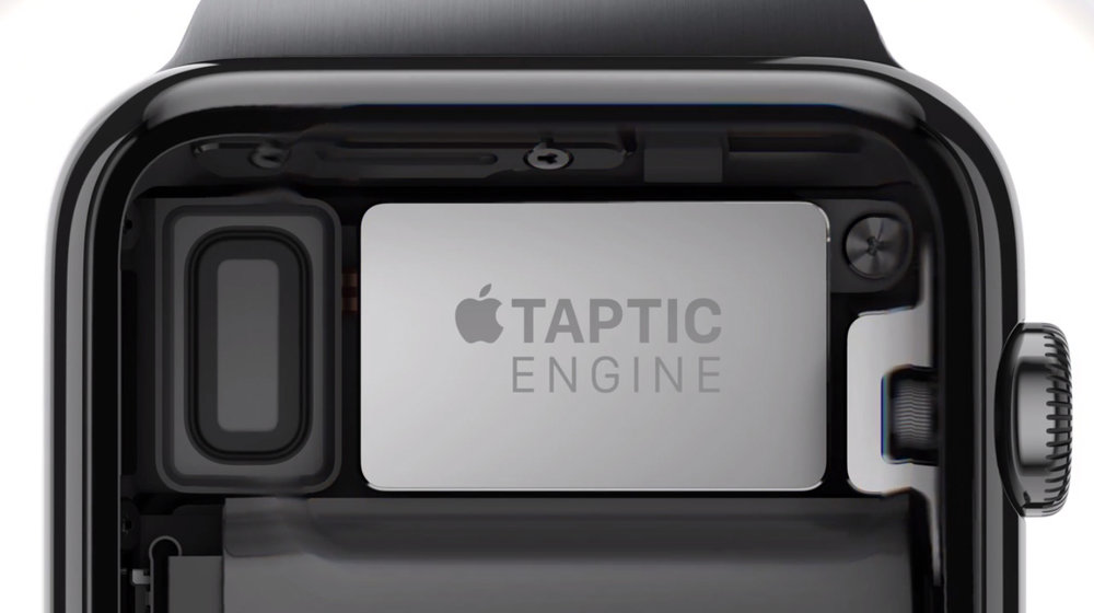
The third hardware novelty is what Apple calls its "Taptic Engine". For many years now, our phones have had a vibrate option for times when audible ringing is socially inappropriate. The Apple Watch takes vibrations to the next level. Unlike an ordinary vibrating motor, the Taptic Engine feels more like a series of subtle taps on your wrist. It's more discrete and far quieter than a phone vibration and it's configurable. Apple spent a lot of time designing the patterns of taps so that with a little practice, you can tell by tap pattern alone what your watch is trying to communicate. One series of taps indicates an incoming phone call, another that you are receiving a text message, yet another pattern signals email. One of the most ingenious uses of this feature comes when you are getting walking directions from the watch. A different pattern of taps tells you at the appropriate time whether to turn right or left. Two weeks in, I'm still learning the different patterns, but I'm most of the way there and it's already proving to be a subtle and powerful way of distinguishing notifications without looking at the watch face.
Software

There are three layers to the Apple Watch's operating system. The primary layer is the watch face. There are ten faces to choose from and some are more configurable than others. If you do choose a watch face that allows for complications, these will appear directly on the face and act as launchers for their respective apps(the weather complication takes you to the weather app, the stopwatch complication takes you to the stopwatch app, and so forth). Swipe up or down on the watch face and you get to the secondary layer. An up swipe gets you to your Glances. These are little cards of useful information as well as some controls for the watch and phone. You choose how many of these you want and in what order they appear through the companion iPhone app. A down swipe on the watch face gets you to your notifications.
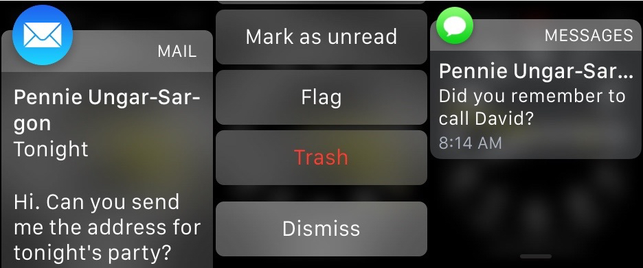
Notifications are one of the Apple Watch's marquee features. It should be stated that the way iOS handles notifications leaves a lot to be desired. Until a few years ago, the user had almost no control over which notifications appeared and even the latest iterations of iOS have been rife with the unwanted intrusion of rogue notifications. The Apple Watch largely solves this problem. It took me a good 4 days to understand which notifications I did and did not want to appear on my wrist. What I realized was that when a person that I cared about was trying to directly communicate with me, I wanted that to appear on my wrist and nothing else. So I left the phone and text notifications on as well as Whats App. And for the first time since the fork, I felt grateful that Facebook Messenger was a separate app, because it meant that I could leave its notifications on while switching off all other Facebook notifications. Email was the trickiest part of this process. What I ended up doing was expanding my VIP list to people who's incoming emails I wanted on my wrist and disabled all other email notifications.
It's not a perfect system, but I've reached a kind of equilibrium where almost everything that appears on my wrist is welcome. The watch is also smart enough to realize when you are on your iPhone, iPad, or Mac and not duplicate notifications that you have already seen on those devices(Hallelujah). I recognize that not everyone has my communication priorities, but the granularity of the system is such that if you invest the time you will have much better control over your notifications and even earn some peace of mind for your efforts.
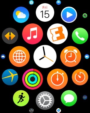
The final layer of the watch interface is the app launcher. I do not have the words to express how much I hate this part of the Apple Watch. Click on the digital crown once when you have your watch face up and you are brought to a honeycomb-like array of tiny, circular watch app icons. My theory is that Jony Ive was watching Cosmos and shouted "Eureka! A Universe of apps!" and we're now all saddled with this abomination. An unruly grouping of tiny touch targets that diabolically resist your intentions, the app launcher on the Apple Watch seems to be the very thing that Apple worked so hard to overcome in the rest of the interface. Why is it here? I understand that Apple sees the watch as a new platform and that third party apps will likely come to define the watch in ways that we can't even imagine. But it's also clear that Apple launched the watch well before they were ready for third party development. The Watch Kit SDK that they released is so limited that it all but guaranteed a generation of useless third party apps. And man alive are they useless. Unless you like waiting for apps to load or looking at spinners, I would recommend avoiding third party watch apps at all costs. Apple should have held off on this part of the equation until they were really ready and maybe left the app launcher off the watch entirely. It feels like it's in conflict with the more rational parts of the interface.
Wrap Up
So what do I think of the Apple Watch? I think it's a useful product that will only get more useful with time. I enjoy the zen of having achieved notification equilibrium. I also like how easy it is to quickly respond to text messages and see my heart rate. And I haven't even mentioned Siri, which for some unknown reason works much better on the watch than it does on the iPhone(my theory is that we hold the watch closer to our mouths). I also find the health tracking/motivational features to be superlative.
I would not recommend that anyone buy the more expensive Apple watches. The mid-range model is made of nicer materials(stainless steel and sapphire), but it's expensive and heavy and not really more fashionable. To be honest, I wouldn't feel comfortable wearing any Apple Watch with a suit, and that includes the absurdly priced Apple Watch Edition with its fuck-the-poor gold body. We all know that next year's model will be thinner and more capable, so it just doesn't make any sense to spend more than $400 on a first generation product.
Is the Apple Watch Sport worth $400? Right now, it does an excellent job of managing notifications, tracking your health, responding to text messages, and paying for things. If you own an iPhone 5 or later and this combination of conveniences appeals to you, then $350/$400(38mm/42mm) seems like a fair price. If not, maybe sit this round out and wait for next year's model. The 2015 Apple Watch is like the ambitious, but overloaded first season of a new TV show that's shaping up to have a lot of potential. My bet is that the show gets leaner and more compelling in the second season, and that by the third everyone will be watching.